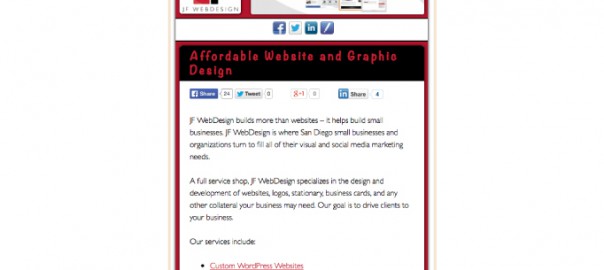
As I came into the office today – yes I know it’s Presidents’ Day and George Washington’s Birthday, but I’m guessing they still worked too – I needed to look something up on a website. So I whipped out my trusty iPhone and typed in the URL. While I’m not going to name the website, it was 100% mobile UNfriendly. Images were overlapping, the menu stretched for miles making me have to scroll all over the place, along with other issues. So I said to myself, “self, you should write up an article stressing the importance of a mobile friendly website.”
When I sat down at my desk, I started to look for some statistics. Low and behold, a really great article on this very subject was already written in the Huffington Post. Why reinvent the wheel, right?
According to the HP article, 5 Reasons You Absolutely Must Optimize Your Website for Mobile, “57 percent of mobile users will abandon your website if it takes more than 3 seconds to load and 30 percent will abandon a purchase transaction if the shopping cart isn’t optimized for mobile devices.” That’s an incredibly important, and mind-blowing, statistic. If the user is on a desktop or laptop, it’s always been said that you have about eight seconds to grab a visitor’s attention. Three seconds is about enough time for me to get to the letter “i” in the alphabet (at a normal conversational speed).
It should be obvious why mobile-friendly websites are important for e-commerce and retail websites. The faster and easier it is to get a person to spend money on your products, the better. But what about for non-profit organizations or political campaigns? Well first things first, stop trying to pretend the purpose of your website is different. Whether you’re a business, non-profit, or political candidate, you’re trying to do the same thing: Sell your product/candidate/cause.
Now that we agree on that – it’s my article so I say we agree -, we can get back to your mobile-friendly site. The bottom line is, the simpler the better. People want to get “in and out” when they are shopping for products or information on their mobile phones. They want to find that item or information instantly. So how do you do this?
Many developers will tell you they can develop a mobile specific site that will be optimized for smartphones. For a product site, maybe it focuses on your shopping aspect while burying your organization information somewhere. Others will tell you the most efficient way is through responsive design that adjusts your site to the window size. Both are correct. What? How can both answers be correct? Well, because anything is better than a site that breaks on a phone. How you choose should be based on your budget.
But if I was going to advise you on the most important, basic piece of a mobile friendly site, it would be your menu. Make sure your menu is easy to navigate and is legible to the eye on a small smartphone. The most effective way I see is the menu style you see on my site here. Go ahead and shrink your browser window down width-wise until you see my menu disappear and, on the top left, three horizontal lines pop up with the word “Navigation” next to them. Click the lines and watch the menu in action.
Cool, huh? A pretty simple way to make your visitor’s experience less frustrating.
Also, while browsing around looking for stats, I came across this little gem, Mobile-Friendly Test. It’s a google tool that will evaluate your site’s “mobile friendliness.” While not 100% accurate, try it out and see what it says about your site.
There are many ways to get your site where it needs to be. If you’d like to talk about ways we can optimize your website for the mobile world, feel free to contact me.

